
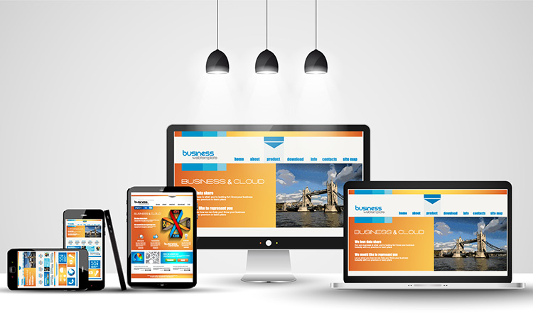
Have you ever found yourself challenged, perhaps frustrated when searching a site from your mobile device? When people conduct a search from their phone, they are usually looking for specific information that is needed right then and there. When you strive to utilize the menu bar, it may be challenging to maneuver and see it efficiently. This is where a responsive design comes into play. Mobile responsive design enables the site’s content to adapt or respond based on the size of the screen it is presented on.
Responsive design involves a optimized code, design, as well as the web strategy.
It’s the crafting of sites that provide optimal viewing and interaction. It impacts the reading, navigating, minimal resizing, panning, and scrolling for a range of devices. It doesn’t matter whether you’re viewing from a widescreen desk top monitor, desktop, tablet, or phone. It is designed to automatically resize, hide, shrink, or enlarge a website to make it look great on all devices.
Sites designed with Responsive web design (RWD) adapts the layout to the viewing environment using fluid, proportional-based grids and images. With a cascading style sheet width property set at 100%, an image will be responsive and scale up and down. It can be scaled up to be larger than the original size. When a maximum width is set to 100% an image will scale down if it has to but wouldn’t be up to being larger than original. The HTML,
Back in March 2018, Google announced their initiative to migrate websites that follow the best practices for mobile-first indexing.
To recap, our crawling, indexing, and ranking systems have typically used the desktop version of a page’s content, which may cause issues for mobile searchers when that version is vastly different from the mobile version. Mobile-first indexing means that we’ll use the mobile version of the page for indexing and ranking, to better help our – primarily mobile – users find what they’re looking for. Read the full article on Google’s Webmaster Central Blog
Our Website Company in Livonia is a Michigan SEO, digital marketing, and web design agency. We service our local community near Livonia, Novi, West Bloomfield, Farmington Hills, Southfield and beyond. In addition to digital marketing services, we are experienced in search engine optimization, PPC marketing (Google Adwords), Michigan SEO, social media marketing, and more!